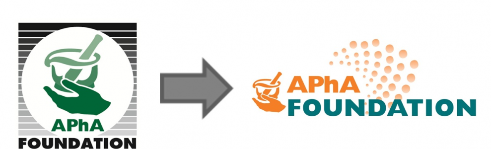
The Background
Our logo is a visual representation of the APhA Foundation brand. Moreover, our logo:
- Serves as a symbol of what we stand for and the message we want to convey
- Serves as an emotional connection point between our audience and our brand
We want our logo to reflect our values:
- Quality
- Patient-centric
- Collaboration
- Innovation
- Respect
- Outcome-driven
- Pharmacists’ role
- Evidence-based
The APhA Foundation is nationally recognized as a leader in transforming healthcare by improving people’s health through pharmacists’ patient care services. Our goal for our new look is to reflect a feeling of inspiration and innovation, both key to who we are and where we’re going.
The Process
Foundation staff conducted an evaluation process to inform the refreshed logo design. This process included:
- A branding exercise
- Inspiration from our PhilanthroSpheRxe branding
- The development of this website
This process reiterated that our identity centers around transformation and innovation. Our brand – and, specifically, our logo – need to visually reflect these central components of our identity and purpose.
The Result
- A new color palette comprised of colors deliberately chosen to convey different characteristics and elicit particular sentiments and impressions (View full color palette)
- A new logo design comprised of design elements that represent and communicate the core components of our identity: transformation and innovation
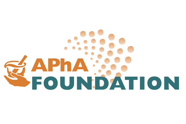
Colors
- Oranges: Confident, friendly, cheerful
- Blues: Dependable, strong, trustworthy
- Greens: Growth, health, nature
Design
- Colors and design elements convey innovation, dependability, and progress
- Incorporation of mortar & pestle reflects close relationship with APhA
- Contrast between orange and teal colors puts focus on Foundation
logo